


Quick Eats
Food Packaging Design | Brand Identity
Food packaging design for a food delivery company.
Conceptualize a brand’s identity and provide a consistent design that can be used across multiple products.
Design multiple food packaging designs based on the brand’s identity.
Objective
This project is to design a delivery app’s brand identity and food packaging. We conceptualize the delivery app’s identity such as solution to a problem and services they provide.
We then provide designs for their business logo, delivery bags, food packaging, advertisements, and other products.
Project
This food delivery app is called Quick Eats. This app is geared towards delivering healthy food to people in San Francisco, California. The problem Quick Eats wants to solve is getting food delivered for the people working in the city. Quick Eats wants to provide a quick and healthy meal in this busy city without the hassle of long wait time from other delivery apps.
Concept
Packaging Design
Food Container
Recyclable Bag
Drink Container
Condiments
Logo Design
Style Guideline
Deliverables
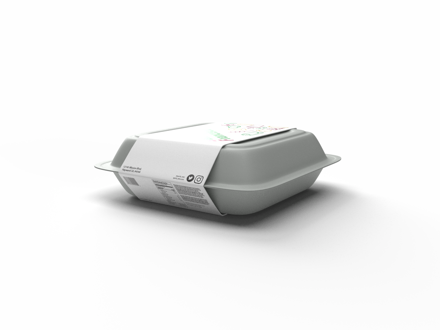
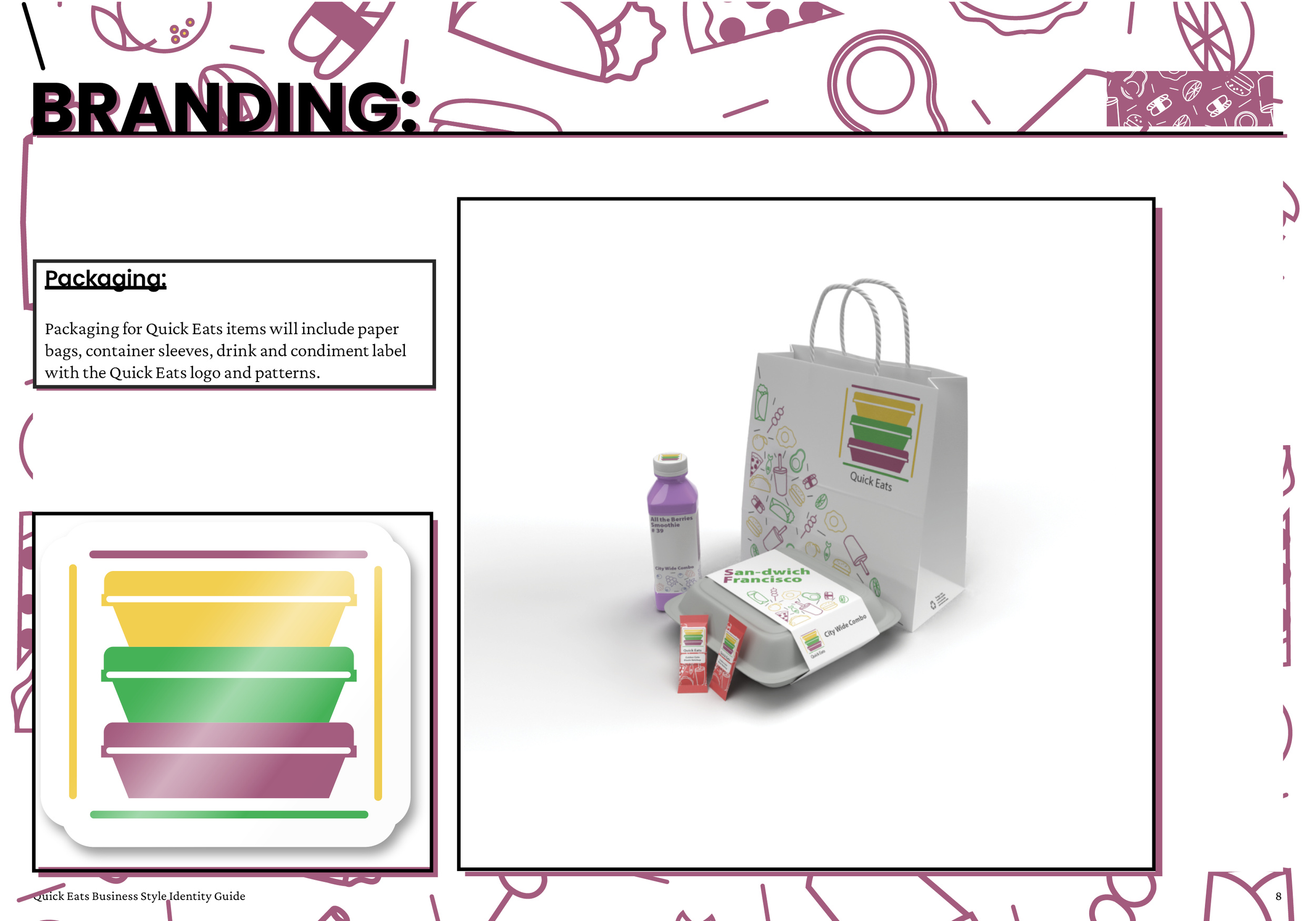
These food packaging designs feature: A recyclable bag, food container, drink bottle, and condiment.
The design I decided to use is creating a pattern of vector graphics of food associated with Quick Eats’ food service. The graphics occupy an area of each product giving color to the design. The empty space provides an ease on print production and cost low.
Food Packaging
The food item on the food packaging is called San-dwich Francisco which is part of their City Wide Combo. The condiment is called Golden Gate Blazin Ketchup.
The drink container is called All the Berries Smoothie and numbered 39 hinting that Quick Eats provides choices of healthy smoothies as drinks.


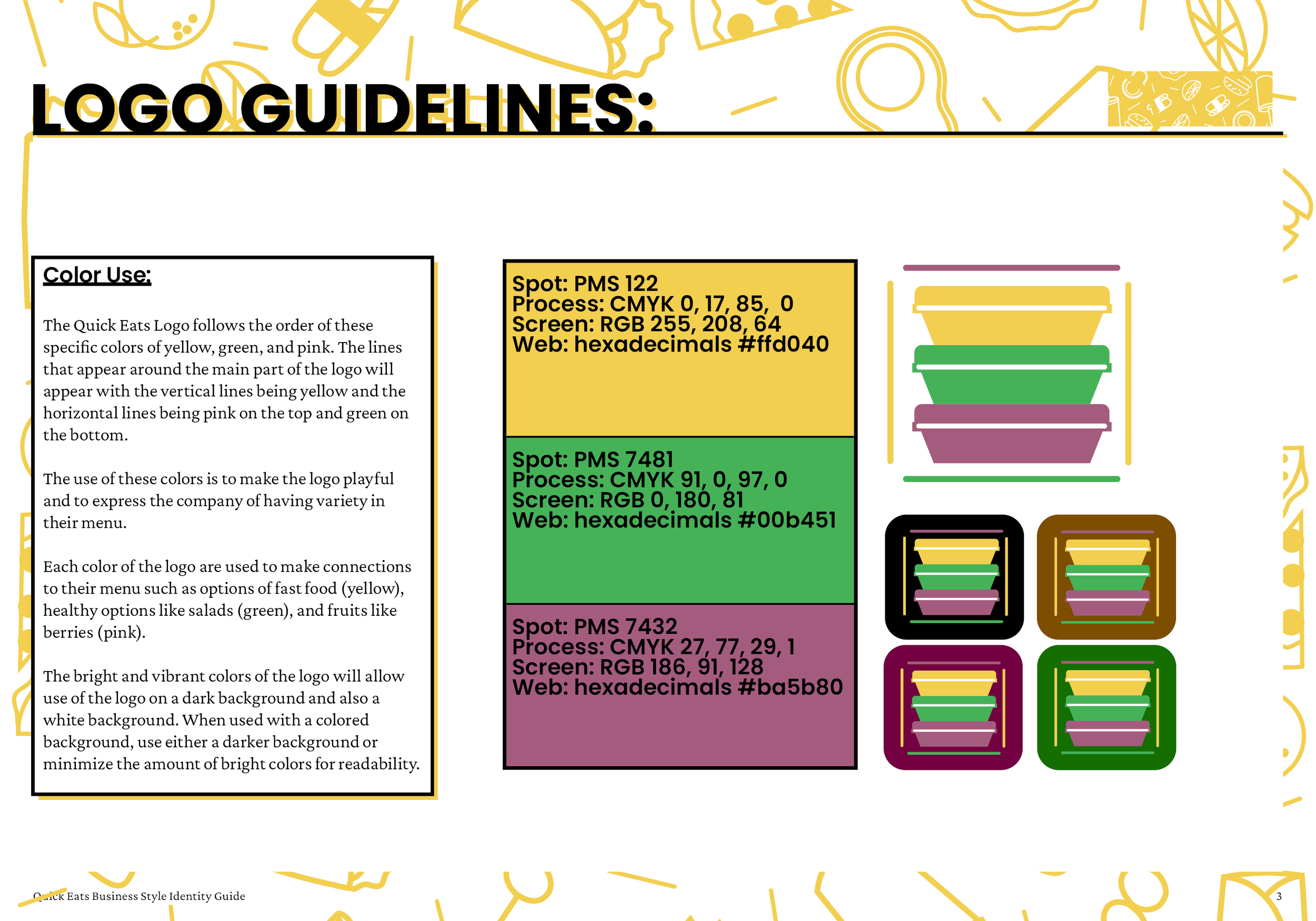
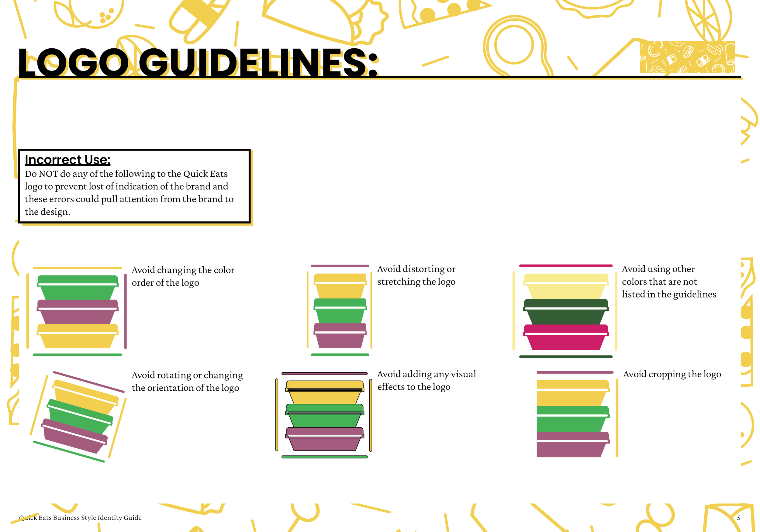
The logo design I went is 3 food containers stacked together. The outer lines around the containers act as a box packaging the food containers to give it a delivery aspect to the logo.
Logo Design
The logo design I went is 3 food containers stacked together. The outer lines around the containers act as a box packaging the food containers to give it a delivery aspect to the logo.

Black and white logo for black and white print.

Colored logo for colored print

Knock out logo for dark colored background print.
The Quick Eats style guide provides the detailed aspects in the brand’s identity from the correct Pantone colors, logo use, and typography. The style guide also provides the design on important documents such as business cards and receipts.
Style Guide
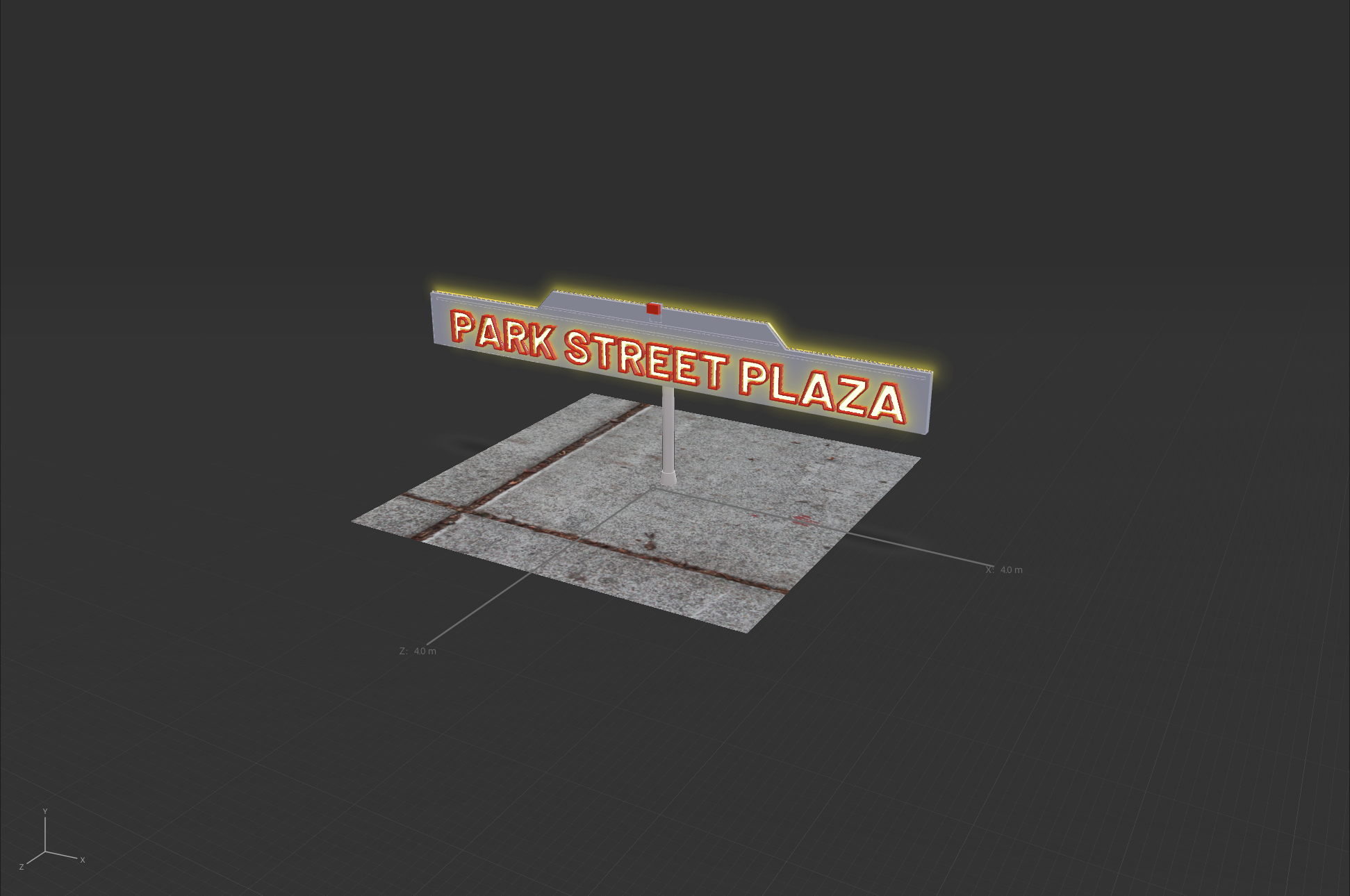
The style guide includes mockups and examples of the business’ promotional advertising, transportation vehicles, and merchandising.


These are the in-progress work before the final designs of the project. During this phase, we were instructed to explore and practice our creative process.
Preliminary work


Adobe Suite Programs:
Indesign
Illustrator
Photoshop
Dimensions